Logo – Defining a Bold Identity for a New Brand
The Audit1 branding process began with a logo that needed to feel both modern and trustworthy reflecting the company’s role in simplifying insurance audits for payroll providers. I designed a mark that balances professionalism with approachability, using strong lines and clean typography to communicate clarity, structure, and efficiency. The result is a visual identity that gives this startup instant credibility in a highly technical space.
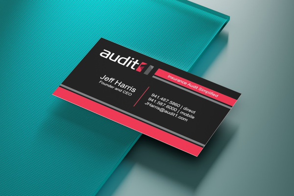
Business Cards – Practical, Clean, and Brand-Forward
Once the logo was finalized, I designed business cards for Audit1 that carried the same sense of structure and clarity. The layout is minimal and intentional with clean lines, plenty of white space, and a confident use of the brand’s color palette. These cards were created to be straightforward and professional, making a strong first impression with potential partners and clients in a niche, compliance-focused industry.
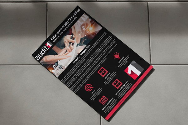
One-Sheets – Simplifying the Complex
To clearly communicate Audit1’s services and process, I designed a set of one-sheets tailored for payroll providers and partners. These pieces broke down a highly technical subject into easy-to-digest sections, using simple visuals, clean layout, and consistent brand styling. The goal was to make audits feel approachable, not overwhelming — and to give sales teams a quick, effective tool for outreach and onboarding.
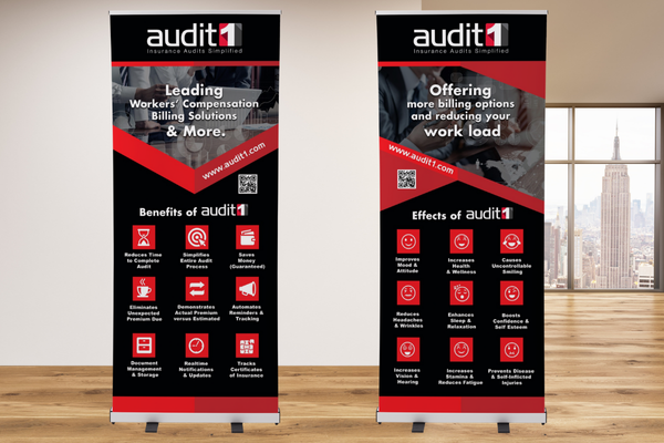
Pull-Up Banners – Instant Brand Recognition at a Glance
For conferences and industry events, I designed pull-up banners that gave Audit1 a strong visual presence in any space. The banners featured bold use of the logo, a clear tagline, and minimal content to ensure the message could be understood quickly from a distance. The clean, vertical layout reflected the brand’s straightforward approach while reinforcing trust and professionalism in a crowded environment.
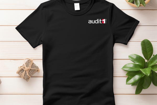
Branded T-Shirts – Casual, Clean, and On-Message
To complement Audit1’s event presence and internal branding, I designed branded T-shirts that balanced professionalism with a casual, approachable feel. The design was kept minimal featuring the logo and tagline in strategic placement to ensure brand recognition without over complicating the look. These shirts were used for team wear at events, meetings, and promotional giveaways, helping reinforce the brand in a relatable and wearable way.
Logo Refresh – Evolving the Brand with a Softer Tone
As Audit1 began gaining traction, the company decided to revisit its color scheme to better reflect its approachable and supportive role in the audit process. The original logo was updated with a new color palette — shifting to more vibrant yet passive tones that tested better with target audiences. The refreshed look helped reduce the intimidating feel often associated with audits, while keeping the core structure and recognition of the original design intact.

One-Sheets – Simplifying the Complex
Following the logo refresh, I redesigned the one-sheets to align with Audit1’s updated color palette and softer visual direction. The goal was to maintain the clarity and structure of the original designs while making the content feel more approachable and less intimidating. Using the new, vibrant-yet-passive tones, these updated one-sheets help build trust and ease with payroll providers — making the audit process feel accessible and stress-free.
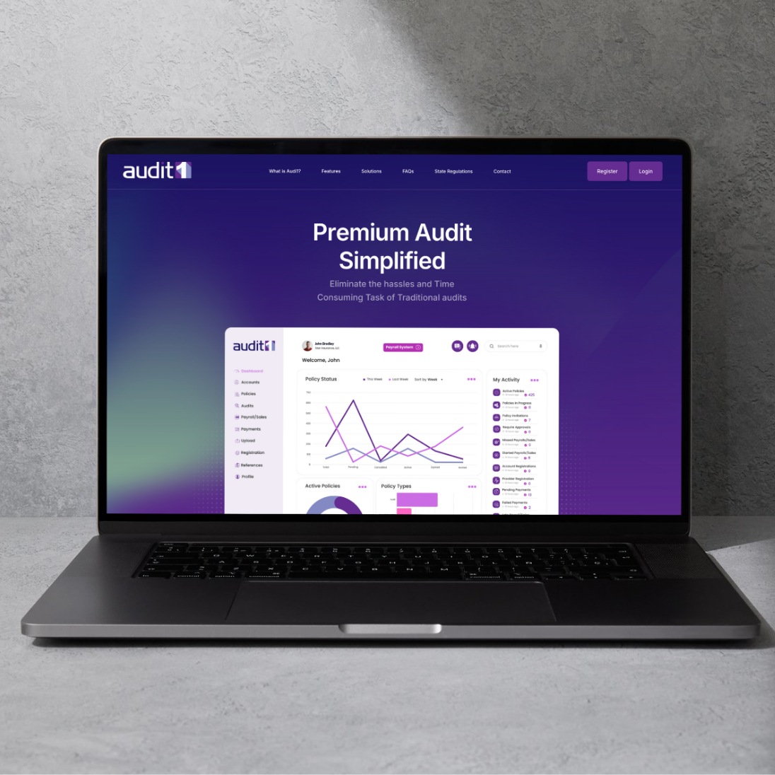
Website Redesign – A Softer, Smarter Digital Experience
After refreshing the brand’s color palette, I designed a new website for Audit1 to reflect the updated look and feel. While I had previously developed an earlier version using the original colors, this new site replaced it and is now the active, public-facing platform. The updated design uses the new, more inviting tones to create a sense of ease and professionalism making the audit process feel clear, approachable, and easy to navigate for payroll providers and partners alike.

Client Portal – A Streamlined Tool for Partners
To complete the digital experience, I designed the user interface for the Audit1 client portal — a secure space for payroll providers to submit audits, track progress, and communicate with the team. Built with usability in mind, the portal reflects the updated brand styling and follows the same approachable tone seen throughout the website and marketing materials. The design focuses on simplicity, clear navigation, and a frictionless user journey, making the audit process easier for everyone involved.